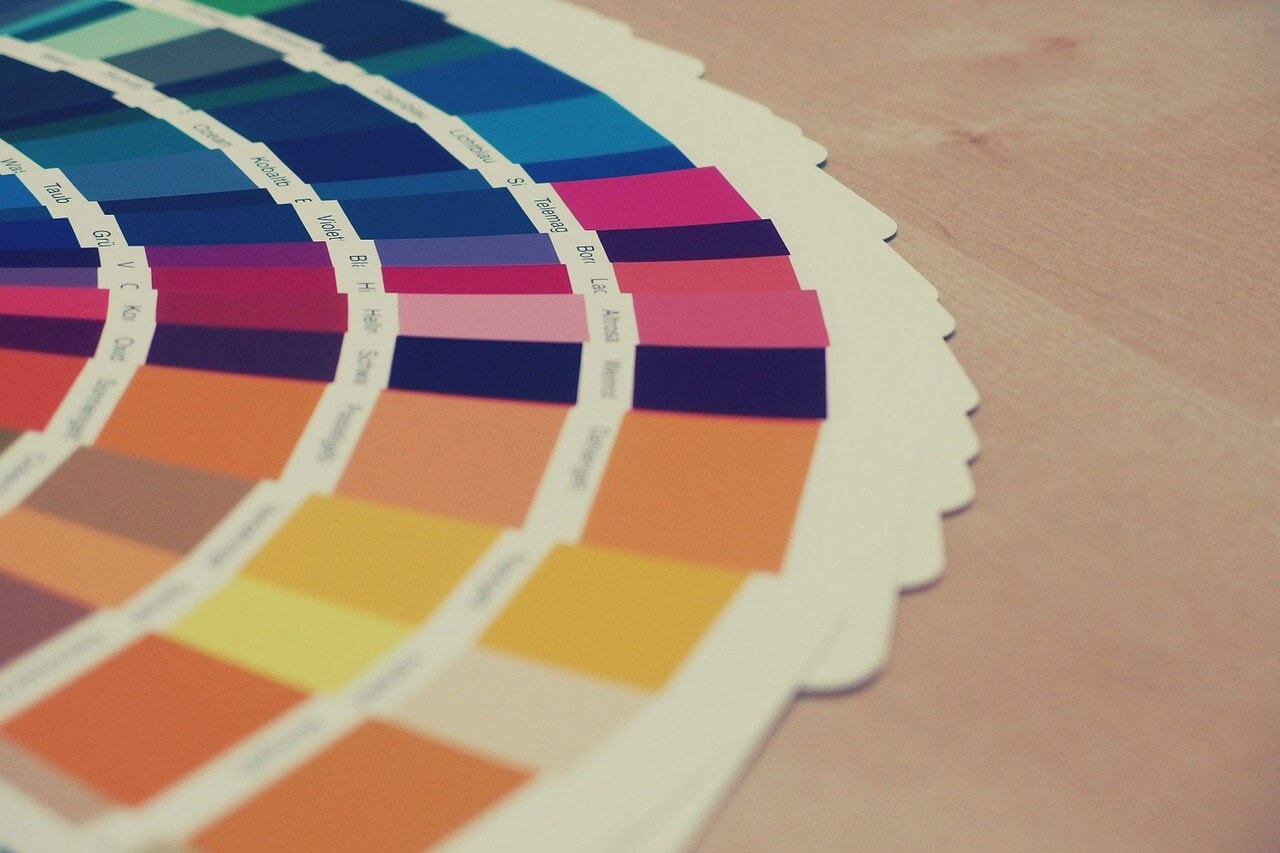
When we’re building a website we’re always aware of the colours we use.
Do they clash in a horrible way? Note how the “fairly” at the top of pages like this on our site is outlined to stop horrible side-effects.
Are they easy to read? Our 11-year-old fairly marvellous trainee is pretty much monochrome colour blind – he’s very helpful when it comes to testing this!
Do they sit nicely on the colour wheel? Colours don’t have to clash to look wrong together.
So this Colour in Branding Infographic from Iconic Fox was particularly interesting. I’m still pleased with our choice of orange as our fairly marvellous brand colour, but I’d like to try a yellow website soon!


